Key takeaways
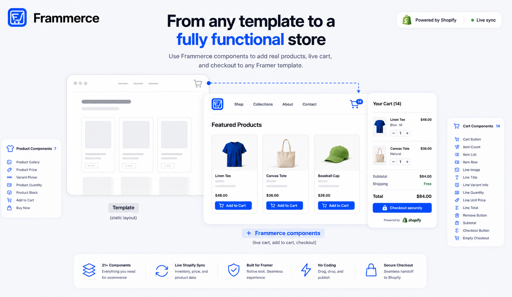
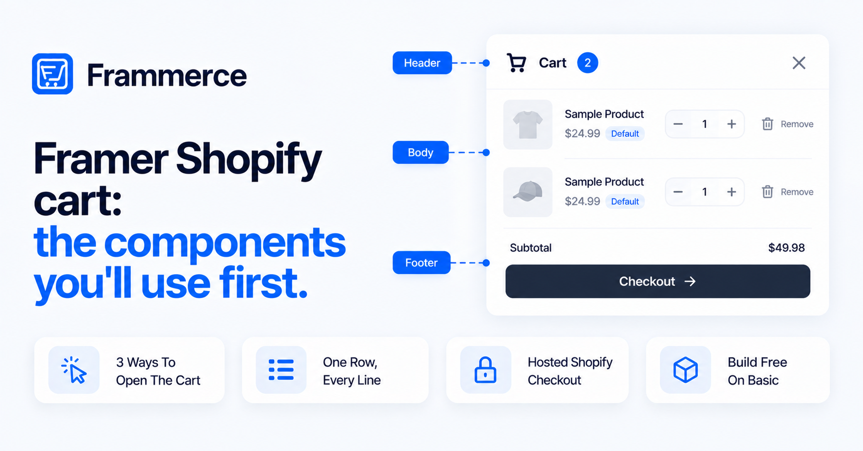
- A Frammerce cart splits into three zones: a header (Cart Button, plus an optional Item Count), a body (Item List, Item Row and the line parts) and a footer (Subtotal and Checkout Button).
- Cart Button opens the cart three ways: Open Drawer, Open Layer or Custom.
- Checkout Button can be inserted and styled on the free Basic plan. Live checkout on a published site is a Pro and Scale feature.
- Item List repeats one row component for every cart line. Line Quantity and Remove Button control each line.
- Payments, PCI compliance and fraud checks stay with Shopify's hosted checkout.
What does a Frammerce cart actually consist of?
A Framer Shopify cart built with Frammerce is a set of separate components, not one block. You place each piece where you want it and style it in Framer's property panel. The runtime connects them.
Think of the cart in three zones. The header holds the Cart Button, plus Item Count if you want a standalone count. Those live in your navbar or wherever visitors look for the cart. The body holds Item List, Item Row and the per-line parts: image, title, variant info, prices, quantity and remove. The footer holds Subtotal and Checkout Button.
The plugin panel uses names like Cart Button, Checkout Button, Item Count, Item List, Item Row, Line Quantity and Remove Button. On the Framer canvas, the layers carry longer names: Cart Checkout Button, Cart Item Count, Cart Item List, Card Item Row, Cart Line Quantity Stepper and Cart Remove Button. This post uses the panel names.
One thing ties them together. Per the cart runtime docs, cart state lives in a single in-memory store shared across all Frammerce components on a page, and it persists so the cart survives reloads and return visits. The runtime talks to Shopify's Storefront API for cart operations: add line, update quantity, remove line and fetch totals. Shopify documents that API in its Storefront API cart guide.
The practical result: add an item on a product page and the header updates. You don't wire that yourself. If you haven't connected your store yet, start with the setup guide.
Cart Button: three ways to open the cart
Cart Button is the entry point. Its On Click control has three modes, and the panel's help text describes each.
| On Click mode | What the panel says it does |
|---|---|
| Open Drawer | Fires the built-in CartDrawer via the cart store. |
| Open Layer | Renders the Cart Layer as a portal overlay with backdrop and slide animation. No separate drawer needed. |
| Custom | Does nothing internally. You wire your own Framer interaction. |
Open Drawer is the fastest route. Open Layer is the one to pick when you want to design your own cart.
In Open Layer mode the panel adds three more sections. Cart Layer takes the Framer layer to render as the cart contents. The panel says to drop your designed cart Frame there and it appears inside the animated panel. Cart Layer Config sets Position (Right, Left or Modal), Width, Height, Animation, Backdrop and Esc Close. For Height, the panel shows that 0 means full viewport height for side drawers, or auto for a modal. Overlay sets Background, Blur and Transition.
The button itself has a Variant control: Icon, Pill or Pill + Label. Labels apply only when Variant is Pill + Label. For Icon, the panel shows Source (Default or Custom), Size and Color. Badge has a show/hide switch, plus Background, Text and Font. Button Style covers Background, Hover BG, Foreground, Height, Padding X, Radius, Border, Shadow and Hover Shadow. Layout adds Margin.
Checkout Button: empty carts and the plan gate
Checkout Button has a When Empty control with three options: Hide, Disable or Show. The panel gives you the three choices. Test each one against your footer layout.
Labels come in two: Idle, which reads "Checkout", and Empty, which reads "Cart is empty" and is used when the cart has no items. Layout offers an Arrow toggle (a right-pointing arrow after the label), Full Width and Margin.
Styling is split three ways. Button Style covers font, text, background, padding, radius, border and shadow. Hover Style covers background, scale and shadow. Disabled Style covers text and background.
Now the plan gate. The component docs describe Checkout Button as handing the cart off to Shopify checkout, gated by plan tier. You can insert and style it on the free Basic plan. The FAQ says that on Basic you can build, preview and click through your entire storefront, and that you upgrade the moment you want real buyers to check out. The pricing page lists live checkout on a published site under Pro and Scale.
The same FAQ says payments, PCI compliance and fraud checks stay with Shopify. The handoff goes to Shopify's hosted checkout, and that part isn't handled inside Framer.
Item Count: the live badge
Item Count is its own component. The docs describe it as a live total item count that updates everywhere. Cart Button also has its own Badge control. Both exist.
Item Count's controls are straightforward. Show 0 is a Yes/Hide switch that renders the badge even when the cart is empty. Labels are Prefix, Suffix and Empty Text. The panel says Empty Text is shown when the count is 0 and Show 0 is on, and that leaving it empty renders the literal "0". The panel shows grey placeholder hints in those fields.
Text Style covers Font, Color, Align, size and weight. Container covers Margin, Padding, Background, Border, Radius and Shadow.
Item List and Item Row: one layout, every line
Item List is the body of the cart. On the canvas it reads "template mode" and tells you to drop atoms inside to define the per-line layout: Cart Line Image, Title, Price, Quantity Stepper and Remove Button.
The Content dropdown picks a row component. Item List repeats that row for each cart line, and sample rows show on the canvas.
Other controls:
- Empty Layer: a custom empty-state Frame. It renders in place of the row clones when the cart has no items at runtime.
- Hide Empty: hides the list at runtime when the cart is empty.
- Layout: Item Spacing, Padding X, Padding Y and Max Height. A Max Height of 0 means no max, and the parent controls scrolling.
- Container: Margin, Padding, Background, Border, Radius and Shadow.
Item Row is a ready-made Framer component. Its panel shows only Framer's standard controls and an Edit Component button. Click through and the popover says the instance is linked to a primary component in another project. It offers two choices: Unlink instance and Unlink & replace all. Per Framer's help article on unlinking, unlinking creates a local, editable copy in your current project.
After you unlink, the layers are Cart Line Image, Cart Line Title, Cart Line Price, Cart Line Variant Info and a Quantity-and-Remove group. Cart Line Image has a Line ID control. The panel says to leave it blank to auto-resolve from a parent Cart Item List (template mode), or fall back to the first cart line.
Line Quantity and Remove Button
The ready-made Item Row already includes a quantity stepper and a Remove button. Line Quantity and Remove Button are the components to use when you build your own row. Both act on one cart line, identified by a Line ID. Leave it blank and each falls back to the first line, which the panel calls handy for one-line carts and quick canvas demos. The panel doesn't say how these two resolve their line inside a row.
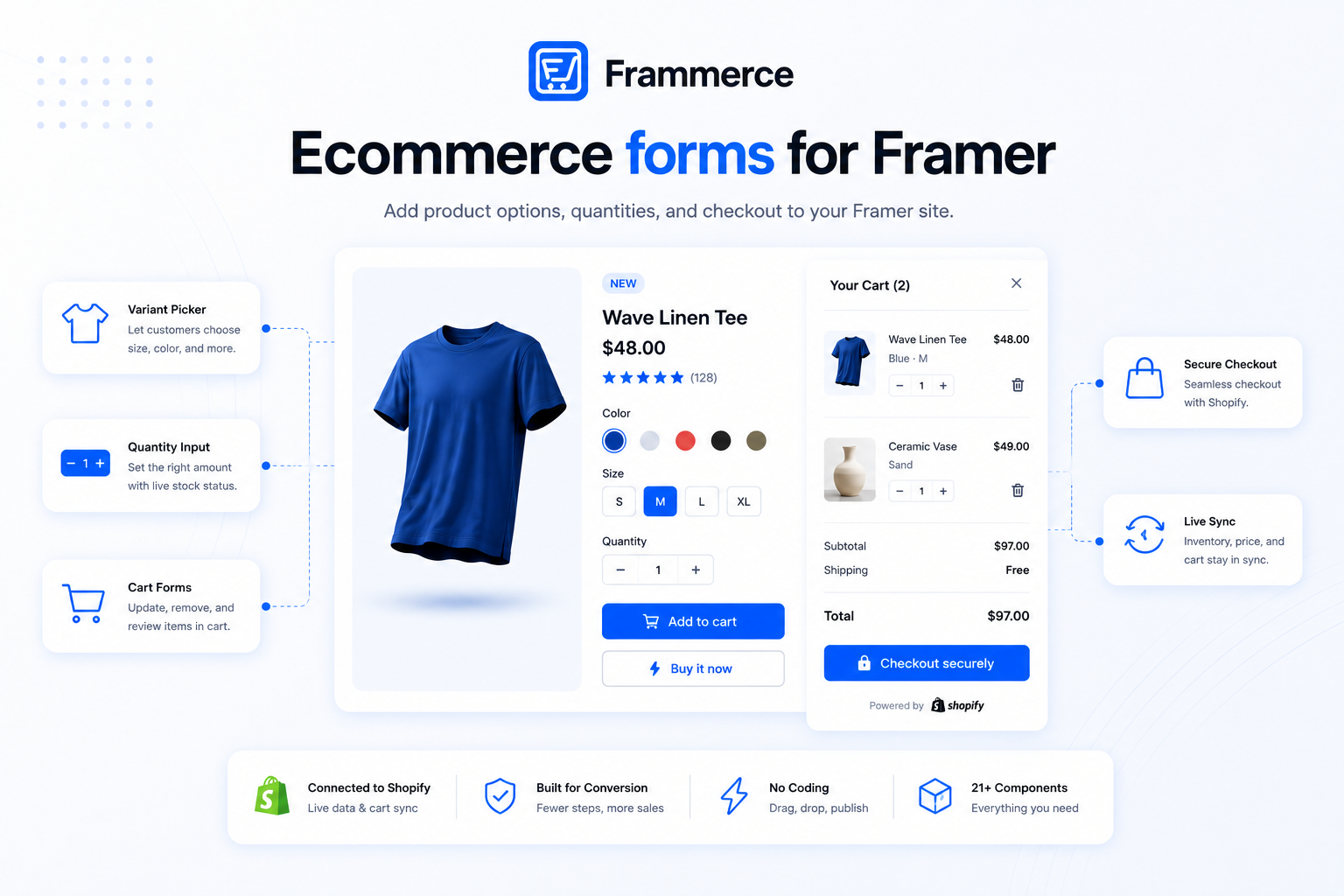
Line Quantity has five modes: Stepper, −, Value, Input and +. Stepper renders the full pill. The other four render a single piece each. The panel says to drop several with the same Line ID to lay out the stepper your own way. That's how you build a quantity control that doesn't look like a standard pill.
Two behavior controls matter:
- Remove at 0: when enabled, clicking − at quantity 1 removes the line entirely.
- Max: the upper bound, inserted at 99. The + button disables once the line's quantity hits it, and Input mode clamps typed values too.
Layout controls depend on mode: Height, Width (Stepper only), Button Size (− and + modes) and Input Width (Input mode only). Button Style covers Radius, Background, Border, Button Radius, Hover BG, Icon Size, Icon Color, Disabled Icon and Disabled BG. Text Style and Container are there too.
Remove Button takes a Line ID, a Text label with a show/hide switch, and an Icon choice of Trash, X or None, with Size. Button Style covers height, padding X, radius, background, color and font. Hover Style covers background and color. Container is the same as elsewhere.
How do the pieces fit together?
This outline shows what connects to what, based on each control's help text. Try it in a scratch project before you build on it.
- Item List's Content control takes a row component, which the list repeats for each cart line.
- Cart Button's Open Layer mode takes a Cart Layer. The panel's help text says "drop your designed cart Frame here." Whether a plain Frame or only a component is accepted isn't documented, so try both.
- Subtotal and Checkout Button sit alongside the list in the footer zone.
- Cart Layer Config then sets Position, Width, Height, Animation, Backdrop and Esc Close for the panel.
Per the FAQ, Basic lets you build, preview and click through your storefront. For notes on keeping the result fast, see the page speed post.
The rest at a glance
These come straight from the component docs:
- Subtotal: currency-formatted total (pre-tax, pre-shipping).
- Close Button: dismisses the cart drawer.
- Line Image: product thumbnail for a cart row.
- Line Title: variant-aware product name.
- Line Variant Info: selected options summary, like Black / Medium.
- Line Unit Price: per-item formatted price.
- Line Total: quantity × unit price.
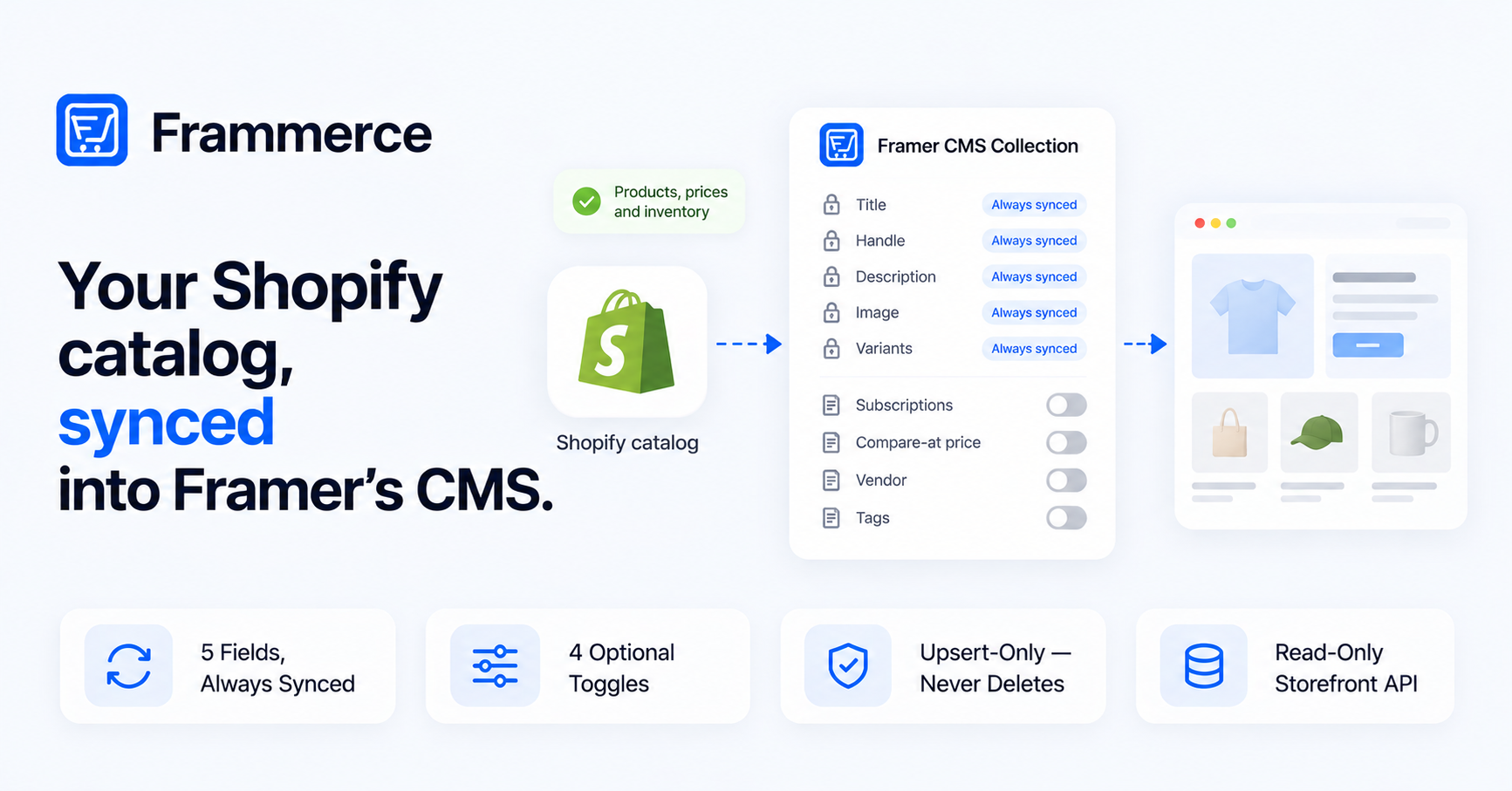
The docs introduction covers the full component set. Product data reaches Framer through CMS sync. Syncing more than one collection is covered in the multi-collection post. If you need a contact or signup form next to the cart, see ecommerce forms for Framer.
Can I use the cart components on the free Basic plan?
Yes, to insert and style them. The FAQ says that on Basic you can build, preview and click through your entire storefront. Live checkout on a published site is a Pro and Scale feature, per the pricing page.
Can the quantity stepper remove an item?
Yes. Line Quantity has a Remove at 0 control. The panel says that when it's enabled, clicking − at quantity 1 removes the line entirely.
Bottom line
Start with four pieces: Cart Button, Item List, Item Row and Checkout Button. The ready-made Item Row already shows a quantity stepper and a Remove button, so Line Quantity and Remove Button are the parts to reach for when you build your own row. Add Subtotal, and you have the core of a cart. Item Count is optional, since Cart Button has its own Badge.
Use Open Drawer to get moving fast. Switch to Open Layer when you want your own design. Build and preview on Basic, then upgrade when you want real buyers to check out. Compare tiers on the pricing page, read the docs, or get in touch if you get stuck.