Key takeaways
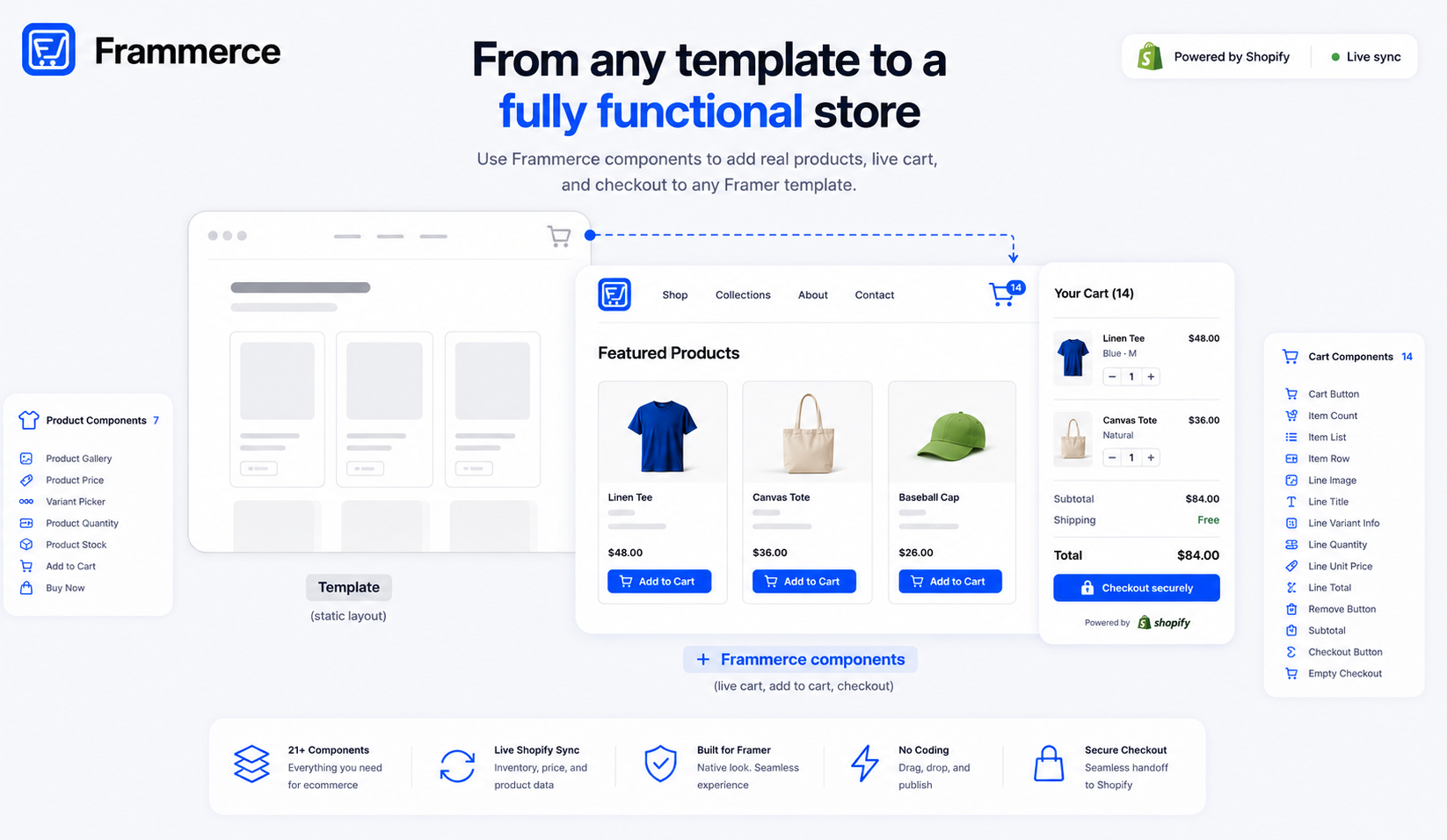
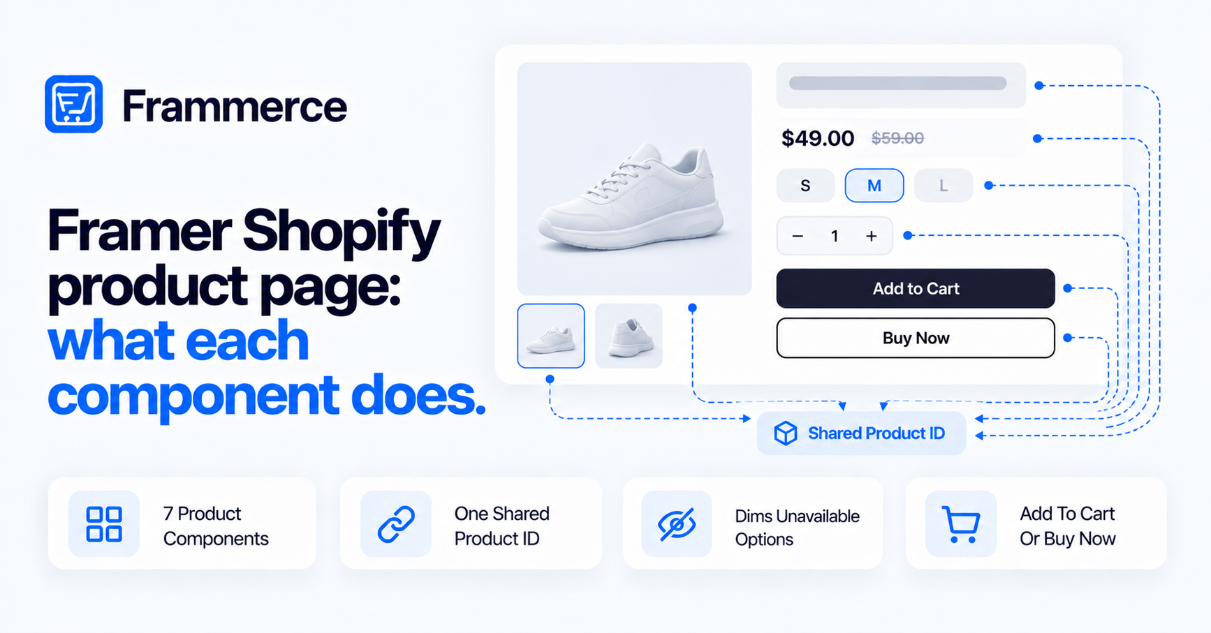
- A Frammerce product page is built from 7 components: Product Gallery, Product Price, Variant Picker, Product Quantity, Product Stock, Add to Cart and Buy Now.
- All 7 share two fields: Product ID (links atoms into one shared variant state) and Shopify Data (an optional CMS binding that feeds that shared state).
- Product Gallery doesn't auto-build a full gallery. Each instance shows one image slot, picked by its Variant control. You place several instances to get a main image plus thumbnails.
- Variant Picker can dim or fully hide option values that aren't purchasable in the current selection.
- Add to Cart is the fuller state machine: live quantity and stock binding, five label states, and an optional After Add step. Buy Now is simpler and always leaves the page after adding.
What's actually on a Frammerce product page?
A Frammerce product page is assembled from 7 components: Product Gallery, Product Price, Variant Picker, Product Quantity, Product Stock, Add to Cart and Buy Now. Each one is a separate Framer component you drop on the canvas and style through its own property panel.
The plugin's panel text has a name for this set: it calls each of the 7 an "atom." That word doesn't show up in the docs or on the Frammerce homepage — it's specific to the panel help text inside the plugin. Framer's canvas layer names run longer and don't always match the panel names either (Add to Cart shows up as "Add to Cart Button" on the canvas, Buy Now as "Product Buy Now"). This post uses the panel names, since that's what you're looking at while building.
What ties the 7 atoms together is two fields that appear on every one of them:
Product ID. Atoms sharing the same Product ID share variant state — pick a size on Variant Picker and Product Price, Product Stock, Add to Cart and Buy Now all read that same selection. Most atoms default this field to main-product. Add to Cart's panel treats it differently: the field is shown as optional, with a "(standalone)" placeholder and help text that reads "leave empty for standalone use." So Add to Cart can run wired into a Product ID group, or on its own.
Shopify Data. An optional field described in the panel as a place to "bind your CMS 'Shopify Data' string field." Set it on any one atom in a group sharing a Product ID, and that atom feeds the shared store, the rest read from it without needing their own binding. Variant Picker's canvas empty state makes the mechanism explicit: when nothing is bound, it shows "No data for productId 'main-product'. Bind Shopify Data on this atom or a sibling."
A few atoms, Product Price, Product Stock and Buy Now, also expose a Default value field (Default Values on Price, Default Stock on Stock and on Buy Now). Product Stock's help text states the general rule: these defaults apply "only when no Shopify Data is bound and no sibling atom has registered." That's the fallback logic across all of them, worth stating once here instead of repeating it component by component.
If you haven't connected a Shopify store yet, the setup guide covers that first, and CMS sync explains how product data actually lands in that Shopify Data field. For the cart side of the same architecture, what happens after Add to Cart fires, see the cart components post.
Product Gallery
Product Gallery's controls: a Variant dropdown (Image 1, Image 2, Image 3, Image 4, plus mobile variants — Default-Mobile, Image 2-Mobile, Image 3-Mobile, Image 4-Mobile), and four separate upload slots, Image 1 through Image 4.
Here's the part worth being precise about: each Product Gallery instance displays one image slot, whichever one its Variant control is set to. It doesn't build a gallery by itself. To get a main image plus thumbnails, you place multiple instances of Product Gallery on the canvas and set each one to a different Variant.
That's a meaningfully different picture than the docs give. The one-line docs description reads "main image + thumbnails for the active product," which reads like a single component that assembles a gallery UI on its own. The panel shows otherwise, Product Gallery is a single image slot, and the gallery layout is something you build yourself out of several instances.
Product Gallery is also a linked Framer component. Open Edit Component on an instance and the popover states it's linked to a primary component in another project, with two options: Unlink instance or Unlink & replace all. That's the same linking mechanism the cart side uses for Item Row, covered in the cart components post, unlinking creates a local, editable copy in your project, per Framer's help article on unlinking components.
Product Price
Controls: Product ID, Shopify Data, a Behavior group (Compare-at Show/Hide, Align with three icon options, Gap), a Formatting group (Locale, Currency symbol style), Default Values (Price, Compare, Currency — these are canvas placeholder values, not guaranteed defaults for a live store), Price Style, Compare Style and Container.
The docs summarize this as "active price, optional compare-at strikethrough," which matches what the panel shows: a price field that can show a struck-through compare-at price next to it, with its own alignment and spacing controls, plus locale and currency-symbol formatting for markets outside a single currency.
Variant Picker
Controls: Product ID, Shopify Data, an Option text field (its help text: "Match a variant option name e.g. Size, Color"), a Layout control (Pills, Swatches, Images), a Swatch Map (a per-value list mapping each option value to a color or image), Labels (label text plus a show/hide toggle), a Behavior group (Direction, Gap, Wrap, Dim Unavailable, Hide Unavailable, Dim Opacity), Pill Style, Pill Active, Swatch Style, Label Style and Container.
One instance handles one option type. A product with both Size and Color needs two Variant Picker instances sharing the same Product ID, one with Option set to "Size," one to "Color."
The feature worth calling out here is Dim Unavailable and Hide Unavailable. The panel describes Dim Unavailable as greying out values that aren't purchasable in the current selection, so if a shopper picks a color that has no Medium in stock, Medium can grey out or disappear from the Size picker without a page reload. That's real, specific behavior confirmed by the panel controls, and it's not mentioned anywhere in the one-line docs summary ("size / colour / material option swatches").
Product Quantity
Controls: Product ID, Shopify Data, Min (set to 1), Max (set to 99), a Layout group (Min Width, Height), a Button Style group (including Disabled Icon and Disabled BG for the stepper buttons), Text Style and Container.
Max's help text is specific: the "+" button disables once quantity hits that number, and Shopify's own per-variant quantity rule narrows the cap further when one applies. In practice, that means the number a shopper can actually reach may be lower than whatever you set Max to, Shopify's own inventory rule for that variant wins.
Product Quantity is simpler than the cart side's Line Quantity. There's one fixed stepper layout here, no mode-switching between Stepper, −, Value, Input and + like Line Quantity offers on the cart, and no Remove at 0 behavior. It's a quantity selector for the product page, not a cart-line control. See the cart components post for how Line Quantity differs.
Product Stock
Controls: Product ID, Shopify Data, Default Stock (In or Out, a fallback value only, per the rule above), Labels (In Stock text, Sold Out text), Text Style (a separate In Color and Sold Color), and Container.
It's the simplest of the 7. There's no Layout group and no Button Style, Product Stock is a status label, nothing more. Worth noting: the docs describe a three-state indicator ("in-stock / low / sold-out"), but the panel itself only exposes two states, In Stock and Sold Out, each with its own label text and color. Whatever low-stock behavior the docs are referring to isn't a control visible on this panel.
Add to Cart
Add to Cart carries the most controls of the 7, and it's the one built as a real state machine rather than a static display.
Controls: Product ID (optional, shown with a standalone placeholder as covered above), Shopify Data, Variant ID (a gid://shopify/ProductVariant/...-format field, with help text explaining it's "used when neither Product Data nor a sibling atom has registered; the picked variant from the shared store always wins when present"), Quantity, In Stock, Stock Count (set to -1 to disable the stock check entirely; bind a CMS field and the button auto-disables once that count hits 0), an After Add control (Stay, Open Drawer or Checkout, described as "where the visitor lands after a successful add-to-cart"), Labels covering five states (Idle, Added, Loading, Sold Out, Pick Variant), an Icon group (Cart Icon show/hide, Arrow show/hide, the panel notes the arrow is "hidden in loading/sold-out/select-options states"), Layout, Button Style, Hover Style and Sold-Out Style.
The Pick Variant label's help text mentions a "Provider" being wired, quoted as the panel states it, since the term isn't defined there or anywhere in the docs.
After Add is the control that decides what happens once the add succeeds: stay put and let the shopper keep browsing (the default framing), pop the cart drawer open, or send them straight to checkout. That range is what makes Add to Cart the more flexible of the two purchase components, see the comparison below.
Buy Now
Controls: Product ID, Shopify Data, Default Variant, Default Qty, Default Stock, a Behavior control (Checkout or Open Drawer, there's no Stay option here), Labels covering four states (Idle, Loading, Sold Out, Pick Variant, no Added state), a Layout group (Full Width, Height, Padding X, Arrow, Margin), Button Style, Disabled Style and Sold-Out Style.
The docs describe it in one line as a "skip-the-cart instant Shopify checkout," and the panel backs that up structurally: Behavior only offers Checkout or Open Drawer, never Stay, and there's no Added label state because there's no "stay on the page after adding" path to label.
Add to Cart vs. Buy Now: which one do you need?
These two components look similar at a glance, both add a variant and both can trigger a purchase flow, but the panels show a real, confirmed difference in how each is built.
Buy Now is architecturally simpler and always navigates away after it fires. Its Behavior control only offers Checkout or Open Drawer; Stay isn't an option. Its variant and quantity data come from static fields, Default Variant, Default Qty, Default Stock, not from live bindings.
Add to Cart's default behavior is to add the item silently and keep the shopper on the page, with After Add as an optional step up to Open Drawer or Checkout if you want that instead. It also has live Quantity, In Stock and Stock Count bindings, with auto-disable at zero stock, none of which Buy Now has; Buy Now only reads static defaults.
So setting Add to Cart's After Add to Checkout makes it behave similarly to Buy Now for that one case. But that's a configuration of the fuller component, not the same component. Buy Now is the purpose-built option for a skip-the-cart flow with less to configure. Add to Cart is the state machine, more label states, live stock binding, and a choice of what happens next.
Bottom line
Seven components cover a Frammerce product page: Product Gallery (built from multiple instances, not one auto-assembling block), Product Price, Variant Picker (with real dim/hide logic for unavailable options), Product Quantity, Product Stock, Add to Cart and Buy Now. All seven share state through Product ID and read data through Shopify Data, with a documented fallback to each component's own Default value when neither is set.
Start by placing one instance of each on a product template, wire them to the same Product ID, and bind Shopify Data on one of them. From there, decide whether the page needs Add to Cart's fuller state machine, Buy Now's simpler skip-the-cart flow, or both side by side.
For the cart that Add to Cart feeds into, see the cart components post. If the page needs a contact or signup form alongside the product layout, see ecommerce forms for Framer. For ready-made starting layouts, see the Framer ecommerce templates post. Compare plan tiers on pricing, read the full docs, or contact us if a control here doesn't match what you're seeing on your own canvas.