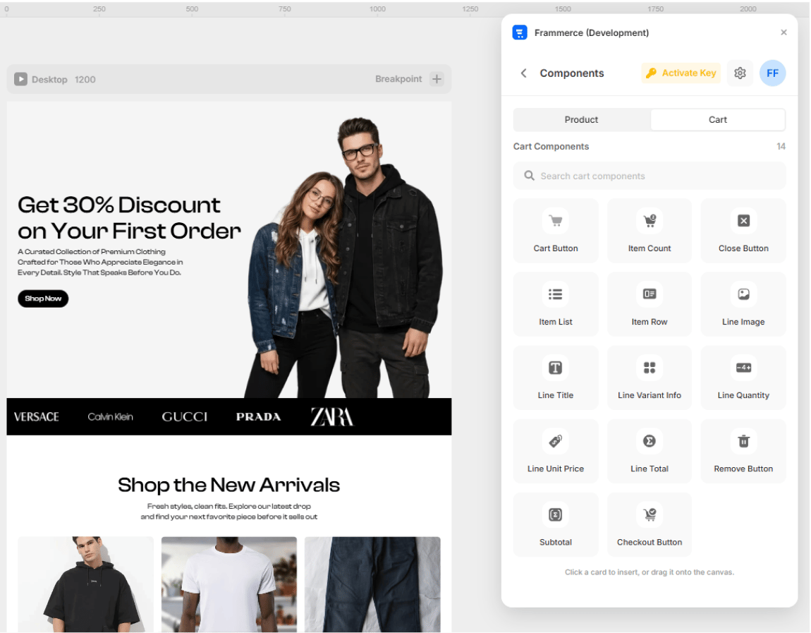
- Click a card in the Components panel to insert at the current canvas position
- Drag a card directly onto the artboard
- Style it with Framer’s regular layer tools (colors, layout, breakpoints)
All 21 components are available on every plan. Design and preview your full storefront on the Free tier - upgrade to Pro or Scale only when you’re ready to accept real orders.
Product components (7)
Used on product detail pages and product cards.
Product Gallery
Main image + thumbnails for the active product.

Product Price
Active price, optional compare-at strikethrough.

Variant Picker
Size / colour / material option swatches.

Quantity Input
Steppers to set the buy quantity.

Stock Status
In-stock / low / sold-out indicator.

Add to Cart
Reactive button that adds the variant to the cart.

Buy Now
Skip-the-cart instant Shopify checkout.
Cart components (14)
Used to build the cart drawer or cart page.
Cart Button
Opens the cart drawer from the navbar.

Item Count Badge
Live total item count, updates everywhere.

Cart Close Button
Dismisses the cart drawer.

Cart Item List
Renders every line in the cart.

Cart Item Row
Layout shell for a single cart line.

Line Image
Product thumbnail for a cart row.

Line Title
Variant-aware product name.

Line Variant Info
Selected options summary (Black / Medium).

Line Quantity Stepper
Inline +/- to change the line quantity.

Line Unit Price
Per-item formatted price.

Line Total Price
Quantity × unit price.

Remove Button
Removes a line from the cart.

Cart Subtotal
Currency-formatted total (pre-tax, pre-shipping).

Checkout Button
Hands the cart off to Shopify checkout. Gated by plan tier.