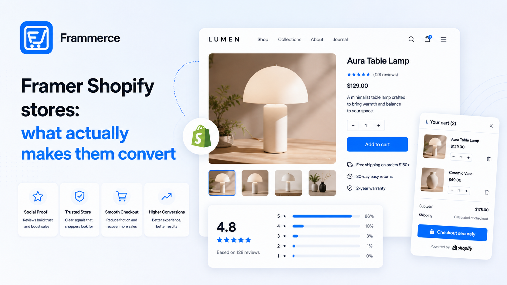
Key takeaways
- What separates a Framer Shopify store that converts from one that just looks nice comes down to a handful of repeatable patterns, not which specific template you started from.
- Reviews are one of the highest-leverage additions you can make: purchase likelihood is 270% higher for a product with five reviews than one with none, and the effect is bigger on higher-priced items.
- Checkout friction still decides more outcomes than visual polish. Average cart abandonment sits at 70%, driven mostly by cost surprises and a slow or complex checkout.
- Trust signals (real photography, visible contact details, clean copy) measurably change whether a shopper sticks around, according to Baymard's ecommerce trust research.
- None of this requires custom code. Every pattern below is buildable with a synced Shopify catalog and Framer's standard canvas components.
What actually makes a Framer Shopify store convert?
Not the template. The underlying patterns repeat across the ones that perform well: a layout that matches the catalog, photography that does the selling before the copy does, visible social proof, and a checkout that does not introduce friction at the last step. Get those four right and the specific design system underneath stops mattering much. (If you have not synced a Shopify catalog into Framer yet, our setup guide walks through the architecture first.)
Layout patterns that fit a Framer Shopify store
The catalog size and shape should decide the layout, not the other way around. A single hero product benefits from a sequential, story-driven page: one product, one scroll, each section building toward the add-to-cart moment. A wider catalog needs the opposite: fast-loading grids, clear filtering, and product cards sized for quick scanning rather than a slow narrative.
Fashion and lifestyle catalogs tend to lean on card-based grids calibrated to consistent photography aspect ratios, since visual consistency across dozens of products matters more than any single hero image. Smaller, curated catalogs (jewelry, home goods, limited runs) tend to perform better with more editorial, storytelling-heavy pages that lean into craftsmanship and material detail. Neither pattern is objectively better. The mismatch, a large catalog forced into a slow storytelling layout or a single hero product buried in a generic grid, is what actually hurts conversion.
There is a middle pattern too, worth naming separately: a mid-sized catalog organized around a handful of collections, each with its own short intro section before the product grid. This works well for brands with a few distinct product lines that do not each deserve a full single-product treatment but still benefit from some context before a shopper starts browsing. It is a reasonable default if you are not sure which of the other two patterns fits, since it borrows a little of each.
Whichever pattern you pick, the layout choice should come before you touch component styling. Building product cards for a hero-product page, then trying to force them into a filterable grid later, wastes more time than deciding the catalog shape up front.
Why do product photos decide the sale before anyone reads a word?
Because shoppers scan images before they read anything else on the page. Baymard's research on ecommerce trust points out that authentic photography of real people and real products reads as more credible than generic corporate imagery, and that a visitor's first impression of whether a site is worth staying on forms within the first 15 seconds of landing. On a product page, the photo carries almost all of that first impression.
For a synced Framer Shopify store, this means treating your Shopify product images as a design asset worth curating, not just uploading whatever came from the manufacturer. Multiple angles, a lifestyle shot in context, and consistent lighting across the catalog do more for conversion than any layout choice on top of them.
Do reviews actually move the needle on a Framer Shopify store?
Yes, more than almost anything else you can add to a product page. Research from Northwestern's Spiegel Research Center found that purchase likelihood for a product with five reviews is 270% greater than for a product with no reviews at all, and most of that lift happens within the first ten reviews a product collects.
The effect scales with price too: the same research found conversion rates increased 190% for lower-priced products when reviews were displayed, and 380% for higher-priced ones. If your catalog leans toward higher-ticket items, a review widget on the product page is one of the highest-return additions you can make, and it is a standard component on most Framer commerce plugins, not a custom build.
How much does checkout friction cost you?
More than your design choices do. Across 50 studies compiled by the Baymard Institute, the average documented cart abandonment rate sits at 70.22%. Strip out shoppers who were just browsing and the top reasons are almost all fixable: extra costs revealed too late (shipping, tax, fees) account for around 40%, a forced account requirement for about 18%, and a slow or overly complex checkout for a similar share.
A well-designed Framer Shopify store can still lose most of its sales at this exact step if shipping costs surprise shoppers on the final screen or guest checkout is not offered. Show the real total early, and let people check out without creating an account.
Does page speed change conversion on a Framer Shopify store?
Yes, measurably. Shopify's own research on headless commerce notes that 40% of consumers will wait no more than three seconds before abandoning a site, and Baymard's trust research separately notes that 47% of visitors expect a site to load in two seconds or less. A headless setup like Framer plus Shopify has a real advantage here: fewer layers between a click and a rendered page than a heavier, template-driven storefront carries.
Large, unoptimized product images are the most common speed problem on a synced store, since the same high-resolution photography that helps conversion can also slow the page down if it is not compressed for the web.
What builds trust on a product page?
A handful of concrete, checkable things: real photography instead of stock imagery, a visible contact method and business details, clean copy free of typos, and payment or shipping badges that are actually accurate. Baymard's research on instilling trust frames this plainly: an aesthetically considered, current, and transparent site signals to a visitor that the business behind it is real and invested, which matters more on a smaller or newer store that has not built up brand recognition yet.
None of this is expensive to fix. It is mostly a matter of not skipping the boring parts (a real about section, working contact links, proofread copy) in favor of only polishing the product grid.
Do you need custom design to make this work?
No. Every pattern above (layout matched to catalog size, curated photography, a review widget, a low-friction checkout, and compressed images) is buildable with a synced Shopify catalog and Framer's standard canvas components. None of it requires writing to the Storefront API by hand or hiring a developer for a standard catalog. (Still weighing a plugin against a fully custom build? We break down that tradeoff here.)
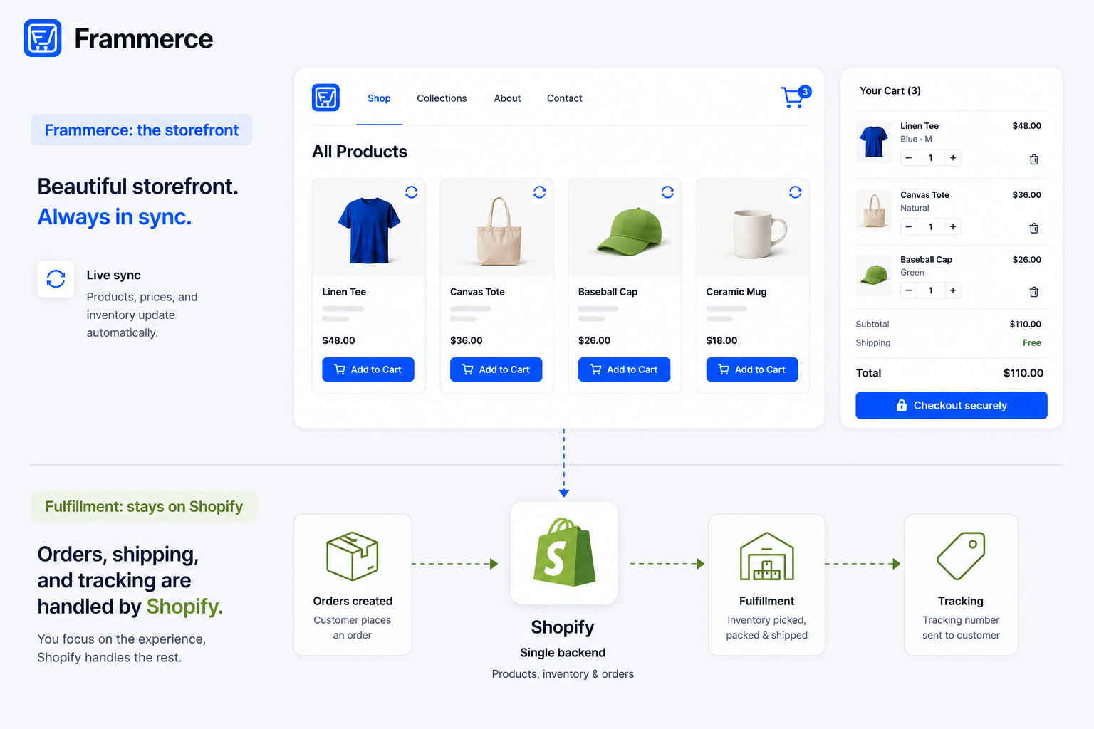
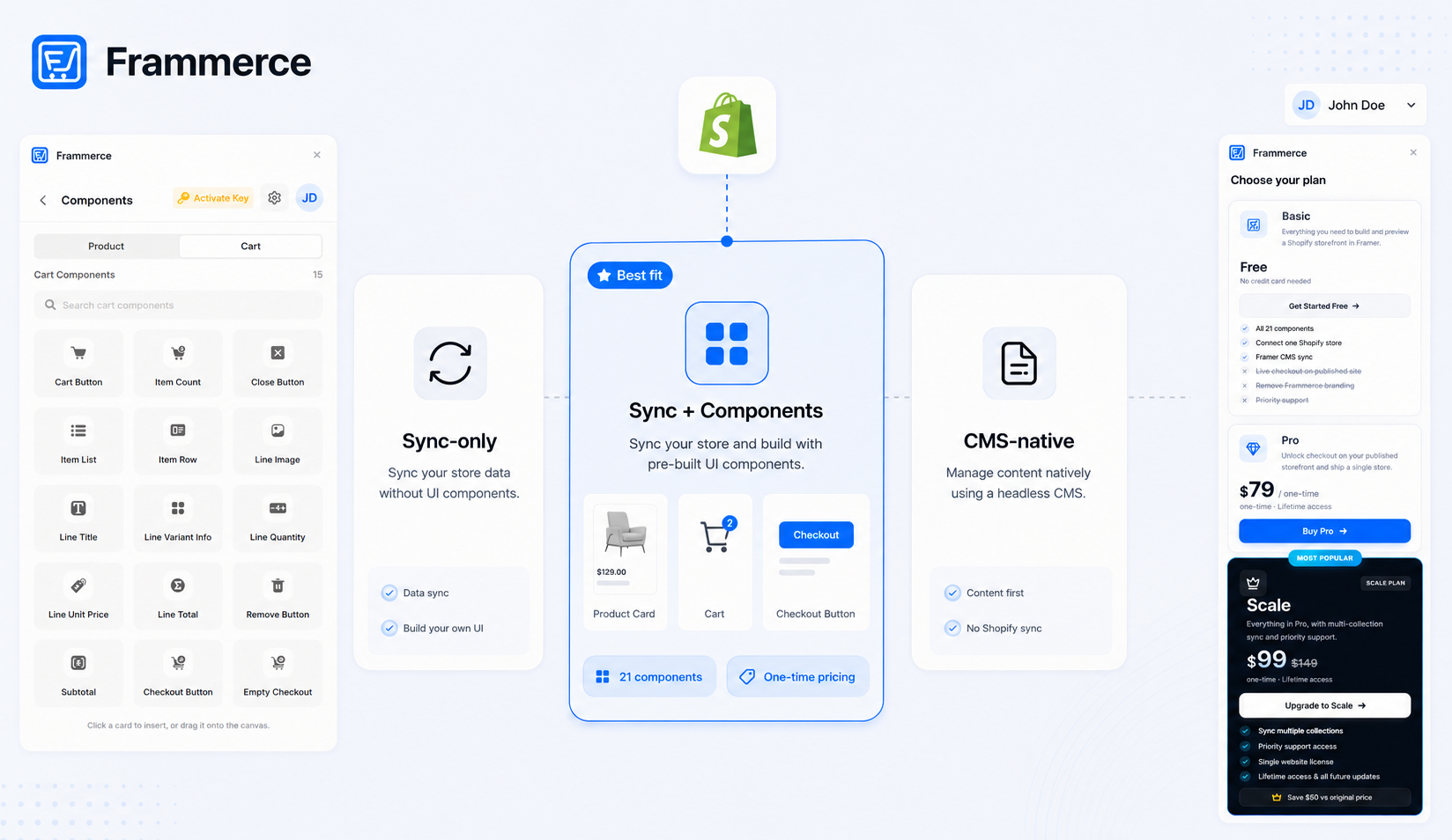
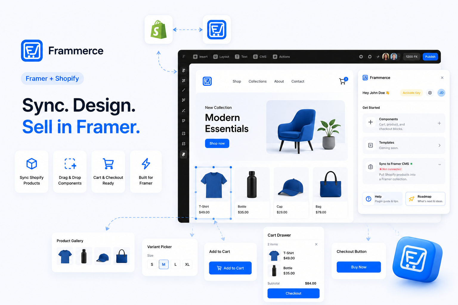
Frammerce syncs your Shopify catalog into Framer's CMS and ships product, variant, and cart components pre-built, so the patterns above are a design and content exercise on the canvas, not an engineering project.
That distinction matters more than it sounds like it should. A team that treats these patterns as a design problem can iterate on them the same way they would any other page: swap photography, reorder sections, add a review widget, and republish, all without touching a codebase or waiting on an engineering sprint. A team stuck maintaining a fully custom build has to route each of those same changes through whoever wrote the original integration, which turns a five-minute content update into a ticket.
Does a bigger catalog need a different approach than a small one?
Yes. Larger catalogs benefit from fast, filterable grids and consistent product photography, while a small or single-product catalog tends to convert better with a slower, more story-driven page. Match the layout to what you are actually selling.
Do I need professional photography to compete?
Not necessarily professional, but consistent. Multiple angles, decent lighting, and a lifestyle shot in context matter more than a studio budget. Inconsistent, low-effort photography is a bigger conversion problem than a modest camera setup.
How many reviews does a new product need before it helps conversion?
Most of the measurable lift happens within the first ten reviews, so even a small number of early reviews is worth actively collecting rather than waiting for volume to build naturally.
Does this apply to digital products too?
Yes. Layout matched to catalog shape, trust signals, and a low-friction checkout matter regardless of whether the product ships in a box or downloads instantly.
Bottom line: building a Framer Shopify store that converts
The design system is not what separates a converting Framer Shopify store from one that underperforms. The patterns are: a layout that fits your catalog size, photography treated as a real asset, visible reviews, a checkout with no late surprises, and a page that loads fast. All five are buildable on a synced catalog with standard components, no custom engineering required.
If you want to connect a Shopify catalog to a Framer canvas and start applying these patterns without writing Storefront API calls by hand, Frammerce is built for exactly that, with pricing that starts free, or get in touch if you want to talk through a specific catalog first.